Buffet Indicator
EXCHANGES > ✓ U.S. Ratios > S&P500 Ratios
DJIA to GDP ratio
Source: MacroTrends
Buffett Indicator
This ratio fluctuates over time since the value of the stock market can be very volatile, but GDP tends to grow much more predictably.
Source: Current Market Valuation
The Buffett Indicator is the ratio of the total United States stock market to GDP. Named after Warren Buffett, who called the ratio "the best single measure of where valuations stand at any given moment". (Buffett has since walked back those comments, hesitating to endorse any single measure as either comprehensive or consistent over time, but this ratio remains credited to his name). To calculate the ratio, we need to get data for both metrics: Total Market Value and GDP, since the ratio is calculated as:
BI = Aggregate US Market Value / Annualized GDP
This ratio fluctuates over time since the value of the stock market can be very volatile, but GDP tends to grow much more predictably.
The most common measurement of the aggregate value of the US stock market is the Wilshire 5000. This is available directly from Wilshire, with monthly data starting in 1971, and daily measures beginning in 1980. For data prior to 1970, the most appropriate data for total stock market value is the ones published by the Federal Reserve, which provides a quarterly estimate of total market value back to 1945.
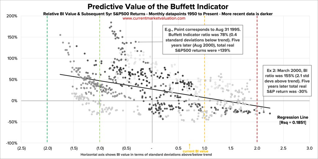
Predictive Value of the Model
While it is never possible to predict future stock market performance, it is simple to look at historical data to see how the market has performed after periods of high and low valuation of the Buffett Indicator.
The following chart shows monthly datapoints from 1950 to 2017, mapping the relative value of the Buffett Indicator model (x-axis) against the subsequent 5 year S&P500 returns (y-axis). The colored, dashed vertical lines indicate the same under/overvaluation bands as shown in previous models (i.e., values to the right of the dark red line indicate datapoints that were > 2 standard deviations above the trend line, indicating the market was 'Strongly Overvalued').
Overall, the chart shows that there is a slight correlation between Buffett Indicator valuation ranking and subsequent S&P500 returns. The highest stock market returns tend to come after periods of undervaluation (left side of the chart). Periods of relative overvaluation (right side of the chart), particularly at the extreme, tend to be followed by lower S&P500 returns five years later.
The Ratio of Total Market Cap to US GDP
A few final comments on this:
- This chart shows correlation, but not causation. The trend here could be pretty quickly undone if the stock market continues its recent strong performance.
- The regression line in the chart above is to indicate the general trend of the data, but not as a claim of statistical significance. The r-squared value here is very low, and time series data like this is vulnerable to autocorrelation, making results seem more significant than they really are. This chart is in no way a guarantee of future stock market performance.
Criticisms of The Buffett Indicator
No single metric is illustrative of the health or relative valuation entire market. Common criticisms of the Buffett Indicator are:
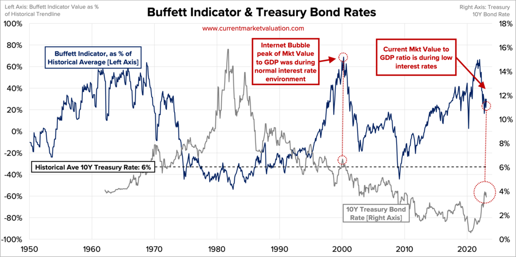
Interest Rates
The Buffett Indicator only considers the value of the stock market, but does not consider how stocks are valued relative to alternative investments, such as bonds.
When interest rates are high, bonds pay a high return to investors, which lowers demand (and prices) of stocks. Additionally, higher interest rates means it's more expensive for businesses to borrow money, making it harder to borrow cash as a way to finance growth. Any business that takes on debt will face relatively higher interest payments, and therefore fewer profits. Less corporate profits means lower corporate stock values. The corollary to this is also true. Low interest rates means bonds pay less to investors, which lowers demand for them, which raises stock prices in relation to bonds. Low interest rates make it easy for corporations to borrow cash to finance growth. Corporate interest payments will be low, making profits higher.
This is all to say that all else equal if interest rates are high, stock prices go down. If interest rates are low, stock prices go up.
Below is a chart showing the interest rate of the 10 Year US Treasury Bond. This is the most vanilla bond there is, and over the last 50 years the interest rate on it has averaged 6%. During the peak of the .com bubble when the Buffett Indicator was very high, the 10Y Treasury rate was a bit higher than average, around 6.5%, showing that low interest rates weren't juicing the stock market. Today the Buffett Indicator is still quite high relative to its historical trend line, but interest rates are still relatively low.
This can be interpreted to mean that during the .com bubble, equity investors had other good options for their money - but they still piled recklessly into stocks. Whereas today, investing in bonds returns relatively little. Today's investors need to seek a return from somewhere, and low interest rates are forcing them to seek that return from riskier assets, effectively pumping up the stock market. While this doesn't justify the high Buffett Indicator on any fundamental basis, it does suggest that the market today is less likely to quickly collapse like it did in 2000, and that it may have reason to stay abnormally high for as long as interest rates are abnormally low.
For additional detail on the effect interest rates have on stock prices, view our Interest Rate Model.
International Sales
A second fair criticism of the Buffett Indicator is that the stock market valuation reflects international activity while GDP does not. Though GDP does include national exports, it would not include something like the sales Amazon makes in Italy (sourced from Italian fulfillment centers). However, Amazon's Italian business is certainly priced into its overall stock price, which is listed in the US. This would therefore drive a higher Buffett Indicator value, since the numerator (total stock market value) is going up, while the denominator (GDP) is unaffected. As globalization has expanded steadily over the last 50 years, this should be a key driver in the growth of the indicator over time. Additionally, this would make the Buffett Indicator value for other (smaller, non-USA countries) even more volatile, as a smaller stock market is likely to be dominated by large international firms.
This is a very fair criticism of the Buffett Indicator itself -- though not necessarily for the valuation model presented here, which looks at the Buffett Indicator relative to it's own exponentially growing trend line. Look again at the Buffett Indicator from Figure 3:
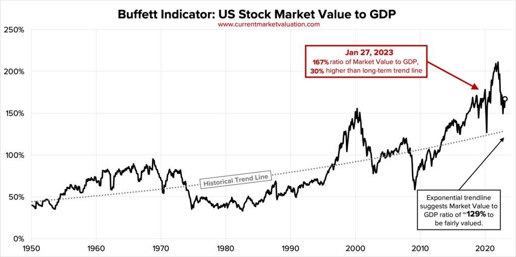
This model expects a "fair" Buffett Indicator value of 50% in 1960, but ~120% in 2020. Part of that natural increase is due to technological advances that lead to higher profits for existing firms, or from the creation of new industries entirely. Another part of that natural increase is because US market value is growing faster than GDP due to the rise of international sales of US-based firms. The key point here is that the model is looking at relative performance against the indicator's own trend rate, and not just saying "the Buffett Indicator is high".